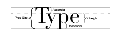
X Height – The height, in points, of the font’s lowercase x.
Baseline – The invisible line that the text rests on.
Ascender – The parts of letters that ascend above the x height.
Descender – The parts of letters that descend below the baseline.
Alignment
There are a couple different ways you can align type, and each has a purpose.
Left Align – Text lines up along the left edge, leaving the right side jagged.
Right Align – Text lines up along the right edge, leaving the left side jagged. This alignment is often hard to read.
Centered – Text is centered within your column of text.
Justified – Text is aligned up on both sides of your column of text with varying spacing between words.
Spacing
Kerning – The space between individual letters. This can be increased or decreased to prevent awkward spacings between letters in a word.
Tracking – The space between words.
Leading – The space between lines of text. This can be adjusted to serve readers. A good rule of thumb is that the leading should always be one point or more than the point size of the font. So, for example, if you have a 12 point font, your leading should be about 13 or 14 points.
Measurement
The size of a typeface is measured from the lowest descender to the highest ascender. When a typeface is 12 point, that means it is 12 points from the ascender to the descender. This is why some fonts look larger than other fonts, even though they’re the same point size.
Comments
add a comment