
Type is one of the most important elements of design. If an audience can’t read the content — then why was it made? Learn font categories and when to use each on.
There are 5 font groups that typefaces are grouped into based on their appearance:
SERIF FONTS
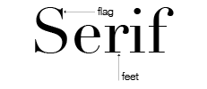
These typefaces have feet on the bottom of the letters, and flags on the ascenders.
Serif fonts are great to use for body copy because it’s easier to read in print.
Don’t know which font to pick for your body copy? Here are some examples:
- Georgia
- Palatino Linotype
- Book Antiqua
- Times New Roman
SANS SERIF FONTS

A sans serif font is exactly that – a font sans the serif. Sans serif fonts are easier to read on the web (find out why.)
Often times these fonts give off a more modern feel than serif fonts, which are more traditional. This is not always true, though.
Examples of sans serif fonts:
- Helvetica and Helvetica Neue
- Open Sans
- Droid Sans
- Arial
In many designs a sans serif font is paired with a serif font. Such as a sans serif headline and serif body copy.
SCRIPT FONTS

Script typefaces mimic cursive handwriting. They are used for display, and never as body copy because no one would be able to read it. Script fonts can be used to emphasis a word in a headline. They’re a great categories for features projects and anything that needs something a bit more decorative.
NOVELTY FONTS

These decorative typefaces are used mostly in ads and special circumstances. Be careful of over-using novelty fonts because they’re difficult to read and can be too cliche.
BLACKLETTER FONTS

Blackletter is used mainly in established newspaper nameplates, such as the Washington Post and the LA Times. They’re display fonts that are seldom used.
Comments
add a comment