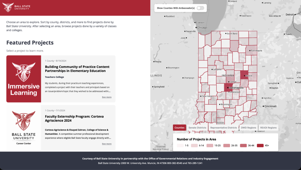
The Design Team creates many kinds of visuals for the Digital Corps, including animations and graphics. As a result, the team focuses greatly on using visual elements to communicate messages effectively. Although all of their projects are well-executed and visually compelling, some stand out among the rest. One such project is the Indiana Interactive Map website, which, despite being packed with data, is visually balanced and accessible to everyday users thanks to the Design Team’s efforts.
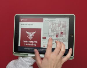
Given the complexity of mapping all the necessary areas and incorporating such a large set of data, this project was only possible via collaboration across the User Experience (UX), Design, and Development teams.

Riley Paulsen, a Design Team Lead, explained, “…because we knew that [the client] wanted a visual solution going in, it was a great chance for all three of those teams to collaborate and be in the meetings.”
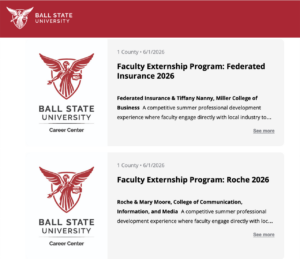
The Design Team created many of the visual aspects of the site—an experience distinct from working on static designs, such as graphics or posters, because it involved a dynamic interface and integrated flexibility. Paulsen described the approach towards text wrapping as an example, “Everything else grows and shrinks along with [the project headings], which is a different type of design than a lot of students are used to working with.” These design requirements challenged the team to think of innovative ways to present information, thus expanding their knowledge and providing them with new techniques to utilize for future projects.
The Interactive Indiana Map website clearly demonstrates the Design Team’s capabilities and talents, specifically highlighting their ability to take on new design projects with both creativity and conscientiousness. At the same time, it highlights the collaboration and camaraderie that are at the forefront of every project that comes through the Corps.