
When BSU staff need data, “Where is that dashboard?” is ideally not the first and then most persistent question. To surface data and analytics more easily and efficiently we’ve launched Ball State’s new Tableau Landing Page to make the fastest path to insight also the most obvious one.
Threading a Needle
This project is the result of three ideas coming together:
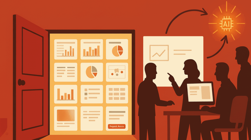
- AI as a useful thought partner. Generative AI helped us explore options quickly. It heard what was needed and sketched options, offered code snippets, and outlined workable approaches for a landing page with thumbnails and access workflows, helpful scaffolding for next steps.
- Skilled analysts make it real. Cole Heady and Naveed Syed in Decision Support took that AI sketch and, in partnership with IT, built a secure, scalable product. They shaped the interface, automated the thumbnail pipeline, implemented consistent blurring for restricted content, and rounded out access requests with the context reviewers actually need.
- Human Interface Design (HID) and refinement. MIDAS, Data Liaisons, Explorers, and ultimately all Tableau users were invited to weigh in on language, groupings, and access logic. The result reflects how people actually search, decide, and act because HID is about what people need and not just what the tech can do.
What the Landing Page does
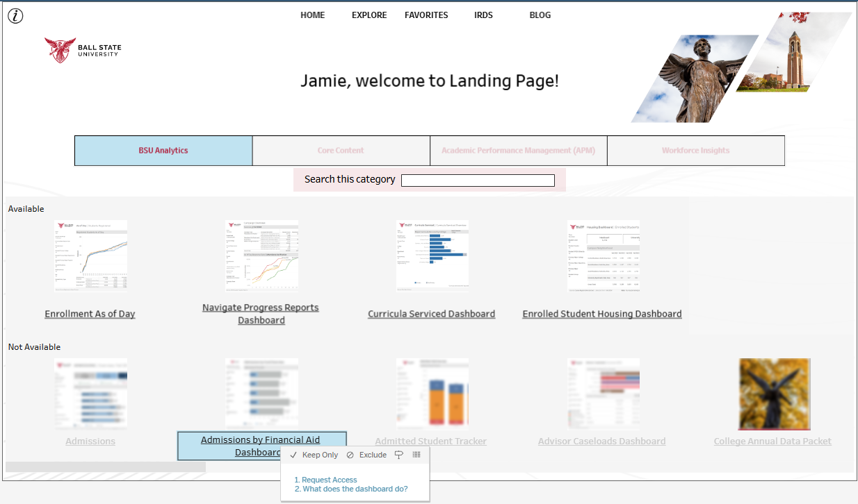
- Visual catalog of dashboards. Browse a single, searchable gallery instead of spelunking through folders. Items you can access open immediately; restricted items show a blurred thumbnail with a pop-up that gives a readable description when clicked.
- Inline access requests. See a dashboard you may need? Learn about it by clicking it and selecting “What does this dashboard do?” That will take you directly to our Data Cookbook where you can find out details about what the dashboard does. You can also request it directly from the pop-up; the request links up with our ClickUp space to make sure it routes to the right people and with the relevant context for reviewers to grant access.
- Clear orientation. A quick “Help” overlay (denoted below in the image by an “i”) explains how the page itself works.
- Continuity for power users. Prefer the traditional folder structure? The familiar Explore view remains one click away in the navbar along the top of the Landing Page.
This snapshot helps clarify what the new Landing Page looks like for a logged-in user and what that user would see when clicking a dashboard that is not available:
Why it matters (and why now)
Ball State’s analytics ecosystem has grown up fast. A modern data warehouse now underpins dozens of decision‑supportive dashboards, and a landing page has been on the roadmap as the one‑stop portal to discover them and request access with the needed context for users to know what they need and what they don’t need.
There is now widespread adoption of our Tableau environment. Over 240 active Tableau users regularly engage with our dashboards today, which is a different scale of demand than even a few years ago; the front door needs to match the traffic.
Our data governance infrastructure is ready for this stress test. Our MIDAS data governance framework and the Data Cookbook definitions bring shared meaning to terms and metrics, and we’re continuing to align dashboards with Data Rating tags so users can see governance status at a glance. The landing page is designed to surface these signals and reduce ambiguity about “which number is official.”
How AI actually helped (and where it stops)
There are recent reports that indicate the vast majority of AI-adjacent projects fail. It may be because there exists a lack of full understanding of where AI can help and where it overpromises. In this case, AI was an excellent help at the first-mile: understanding the range of the possible, sketching workflows, and drafting pseudo‑code in Python. We treated those outputs as prototypes, not products. From there, people with the appropriate skills did the parts only humans can do, including:
- Security and scale. AI is like a third base coach that is always waving the runner to go for home plate. Human analysts and engineers need to slow down and evaluate best practices, least‑privilege access, and performance tuning. Humans need to figure out how the solution can fit in our current infrastructure while also extending it enough to add value.
- Data alignment and access. Linking thumbnails to governed entities in Data Cookbook forms a tight feedback loop to make sure the right dashboards are granted to the right users; this requires human work and judgment.
- User experience. Professional staff needed to create dashboard titles, groupings, and descriptions that match campus mental models and refine that with feedback from the community of users.
In short, AI helps explore the opportunity space; then professionals design, validate, and own the result. That balance is how we move forward and keep trust.
Where we’re going next
- Search that reaches deep. We’re expanding metadata‑driven discovery (e.g., fields, tags, ownership, quality signals) so people can find dashboards by the concepts they use in conversation, not just titles. We are also exploring whether we can reach deep into the dashboard XML to surface a context-aware search function.
- Load times and groupings. We’re tuning thumbnail generation cadence and category logic so the gallery loads quickly and clusters dashboards intuitively.
- Surfacing new data and definitions. As more definitions are approved and more dashboards are certified, the landing page will automatically surface that new data for end‑users to review.
Acknowledgments
A big thanks to Cole Heady and Naveed Syed (Decision Support) and our partners in IT and across data‑owning units for making this production‑grade. The landing page is a model of how IRDS works today: modern infrastructure, disciplined governance, human‑centered design, and pragmatic use of AI where it adds speed without compromising standards.
This launch builds on IRDS’s multi‑year evolution, warehouse modernization, governance via MIDAS, training (including a growing Tableau Users Group), and a shift from reporting to actionable analytics; which are all aimed at faster, clearer decisions in support of student success.
Discover more from Data Insider
Subscribe to get the latest posts sent to your email.